J20
A brand new identity for a 90's classic.
Brand strategy
Brand identity
Logo design
design
Brand Guidelines
A brand new identity for a 90's classic.
Brand strategy
Brand identity
Logo design
design
Brand Guidelines
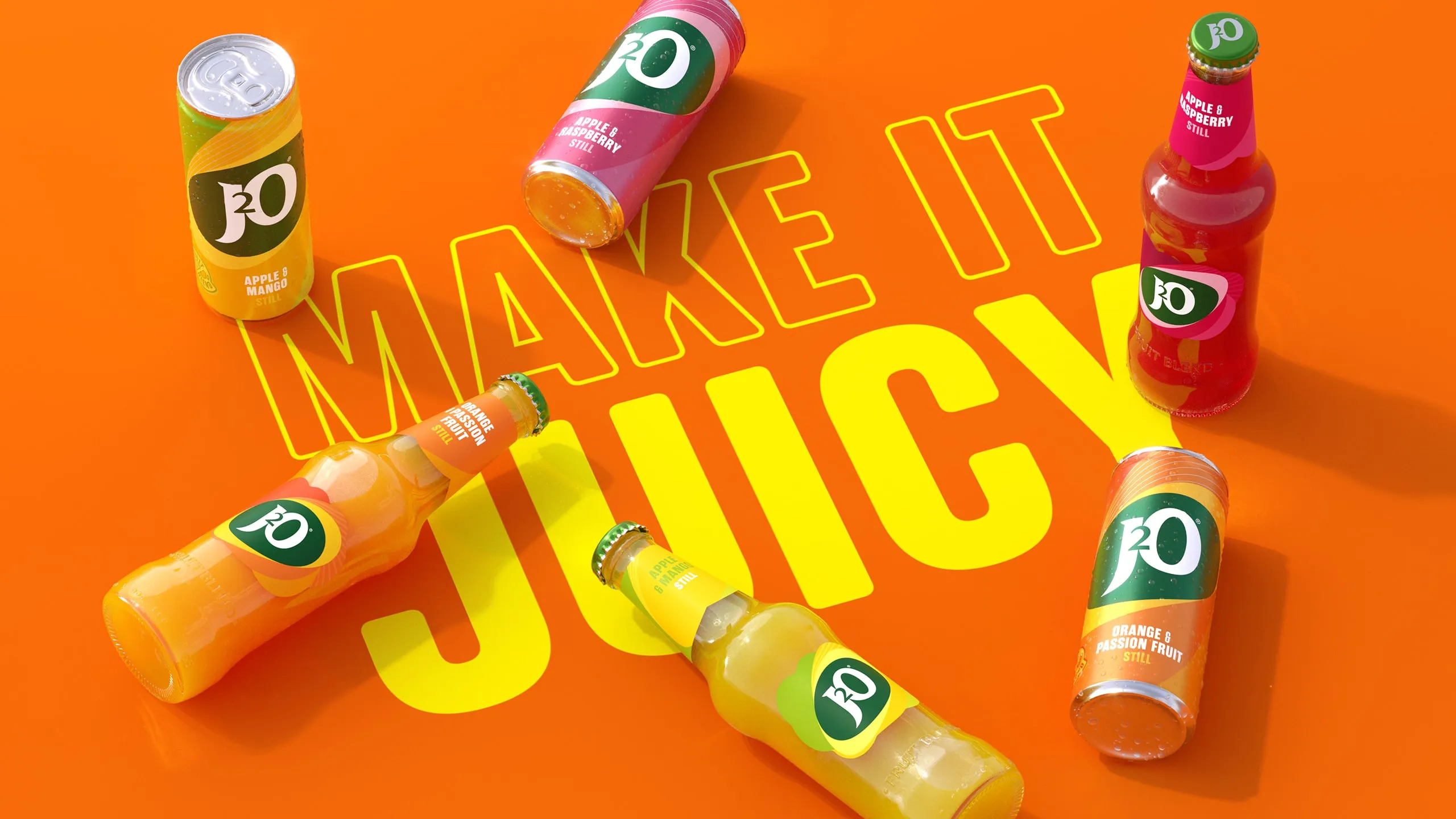
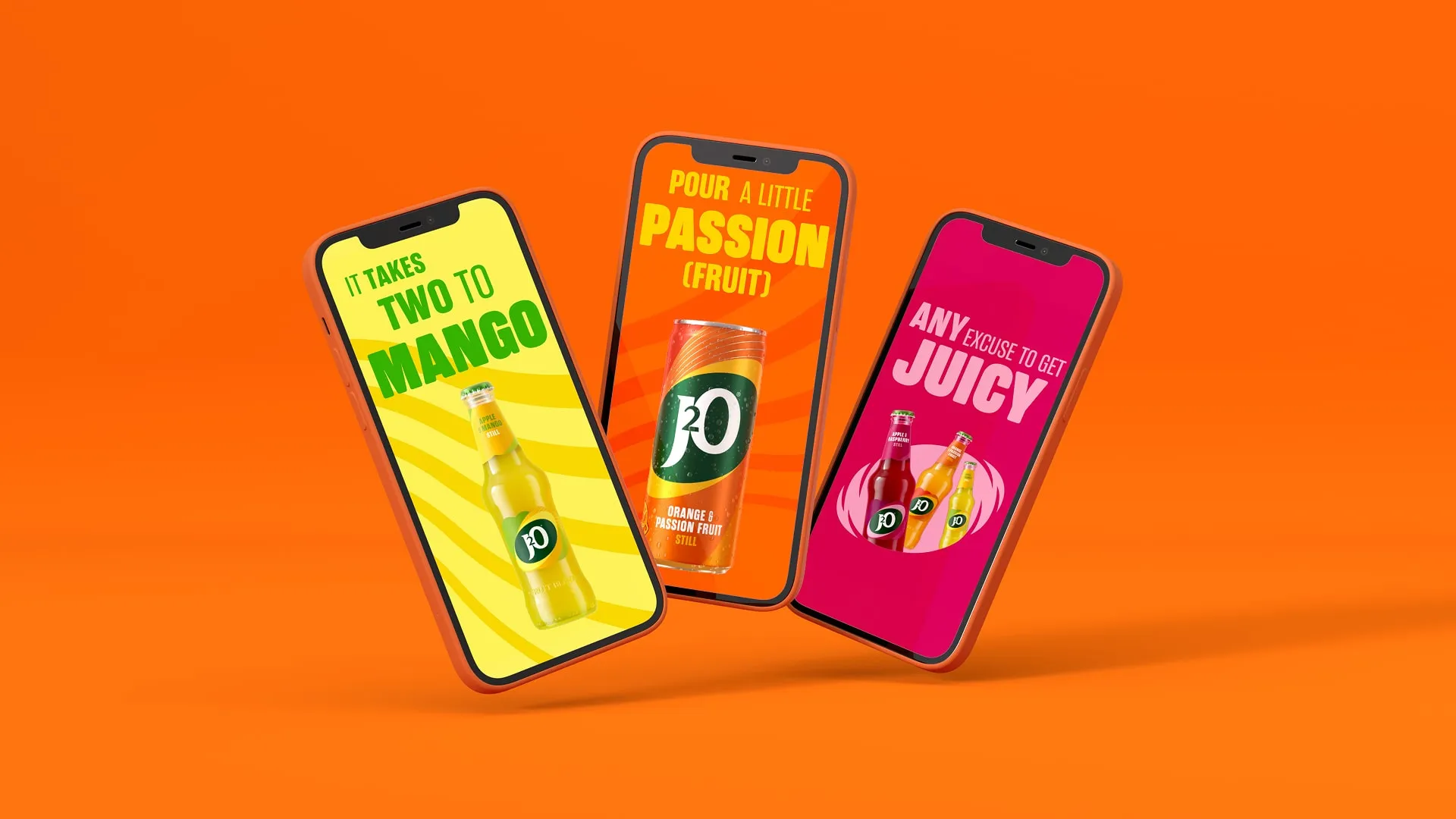
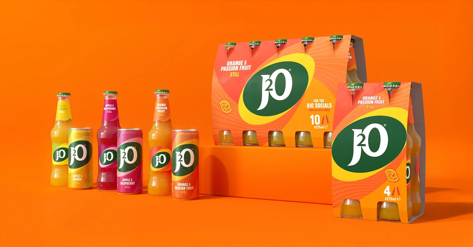
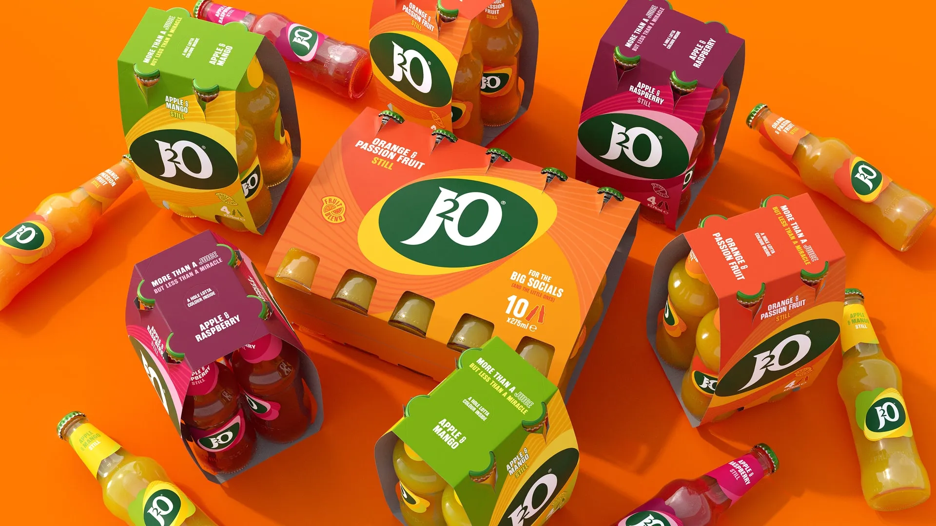
A beloved staple since ’98, we helped J2O evolve with a bold new identity that speaks fluent group chat — fresh, playful, and built for today’s anything-goes socialising.
From easy evenings to spontaneous meetups, the new look blends pared-back confidence with vibrant expression — echoing the flavour twists at its core.
J2O’s redesign taps into two generations of brand nostalgia while landing firmly in the now.
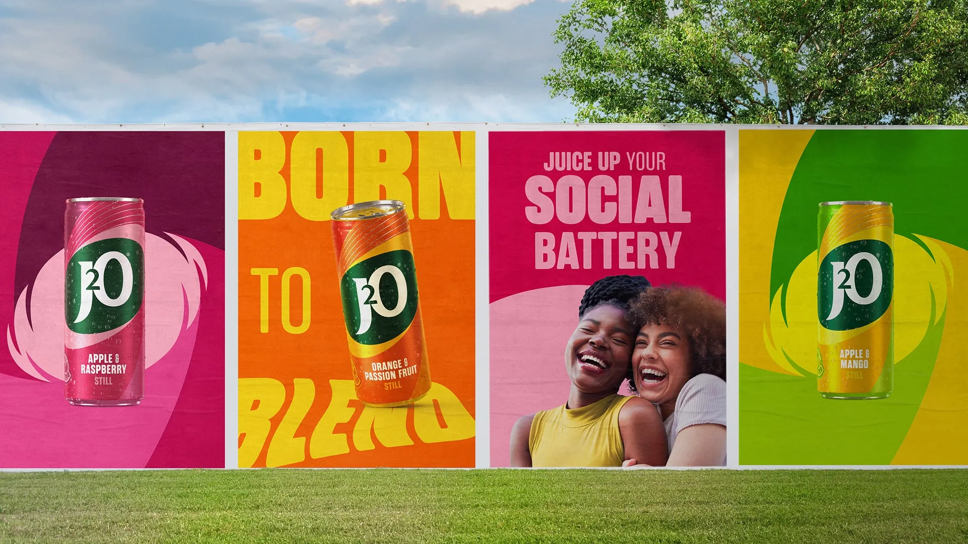
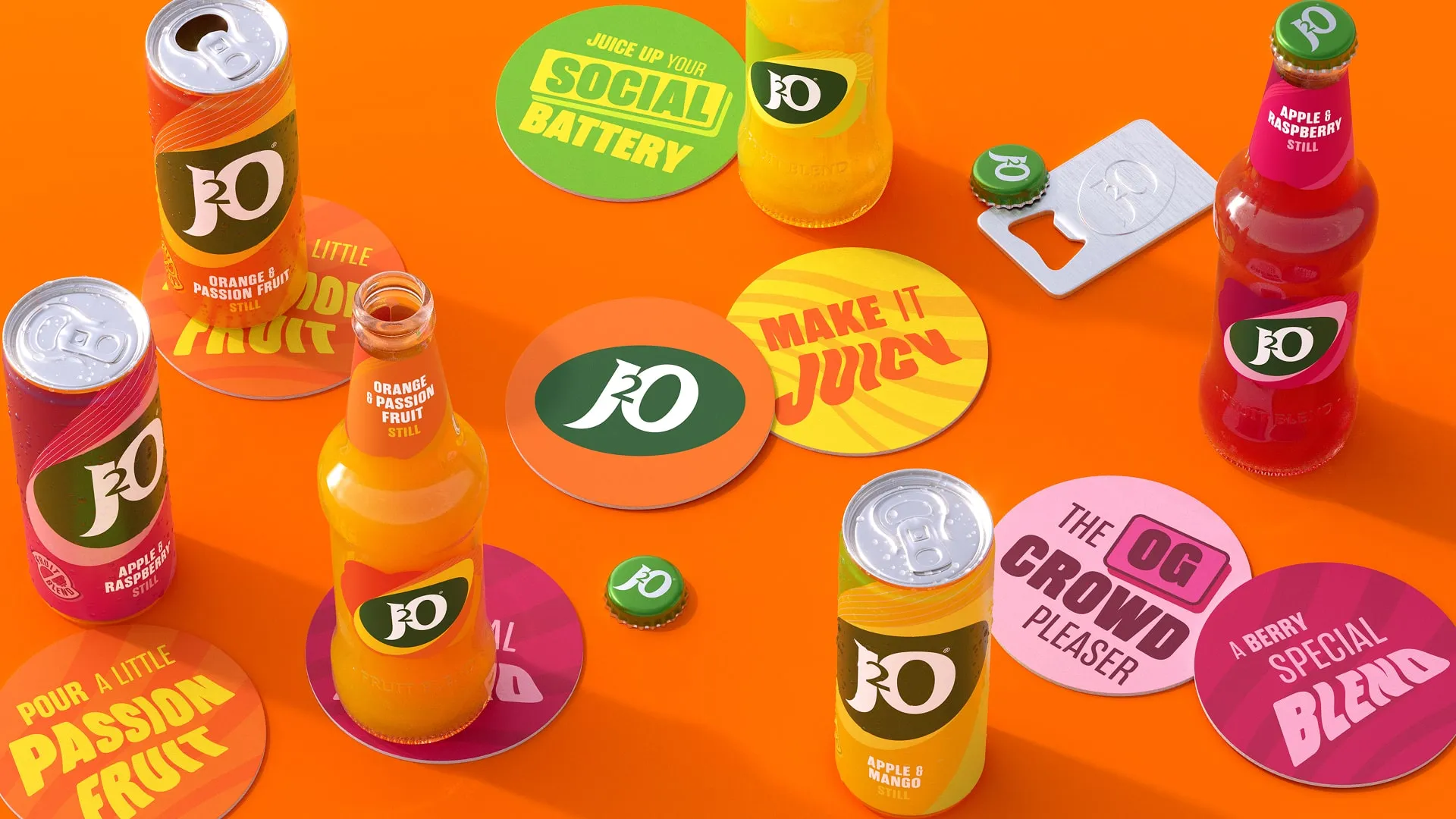
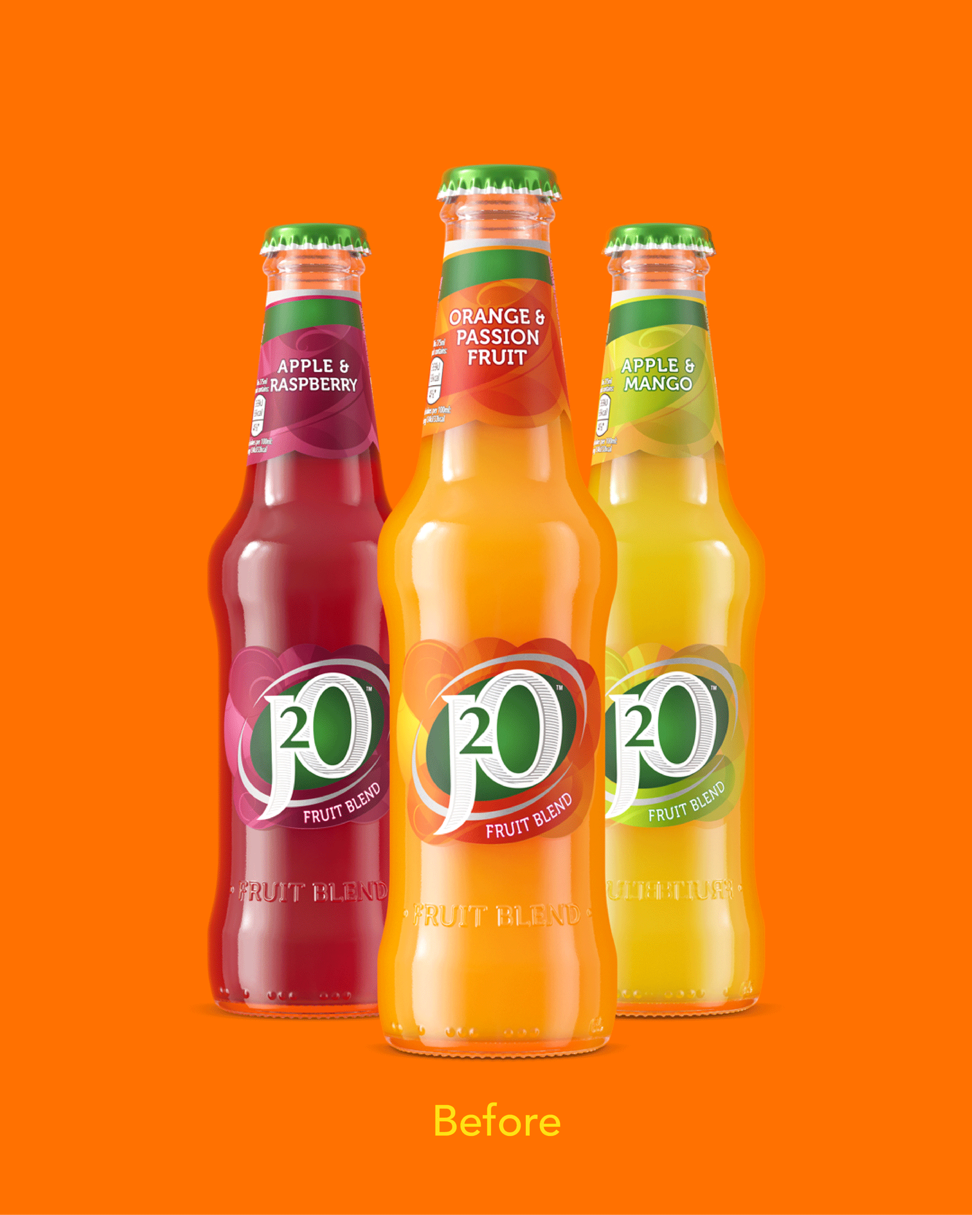
Brighter colours, juicier packs, and an off-centre energy that’s just the right amount of unconventional. A reawakened visual identity, a packaging redesign that is instantly familiar but now bolder and braver, and a strong set of key brand assets that allow the J2O world to stand out loud and proud.
25 The Village,
101 Amies Street,
London SW11 2JW
+44 (0) 20 7924 4533
hello@bloom-london.com