Tango
A disruptive new identity for a disruptive soft drink.
Brand strategy
Culture Audit
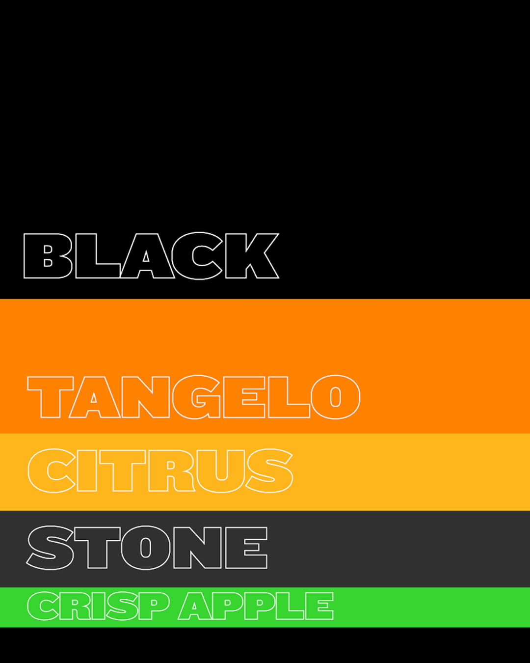
Brand identity
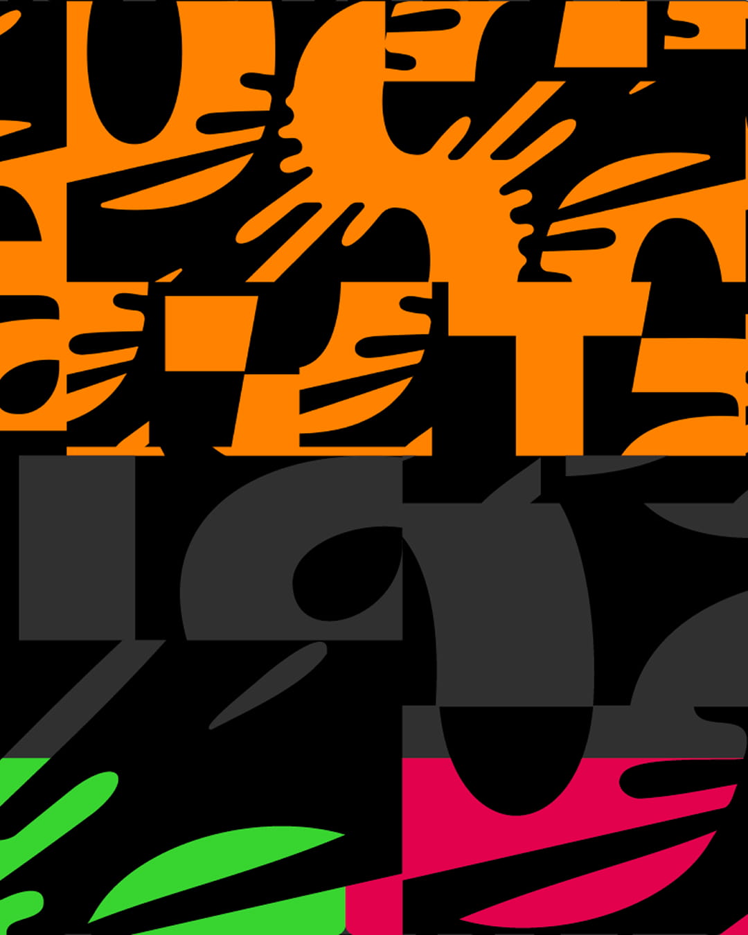
Art direction
Brand Amplification
Brand Guidelines
A disruptive new identity for a disruptive soft drink.
Brand strategy
Culture Audit
Brand identity
Art direction
Brand Amplification
Brand Guidelines
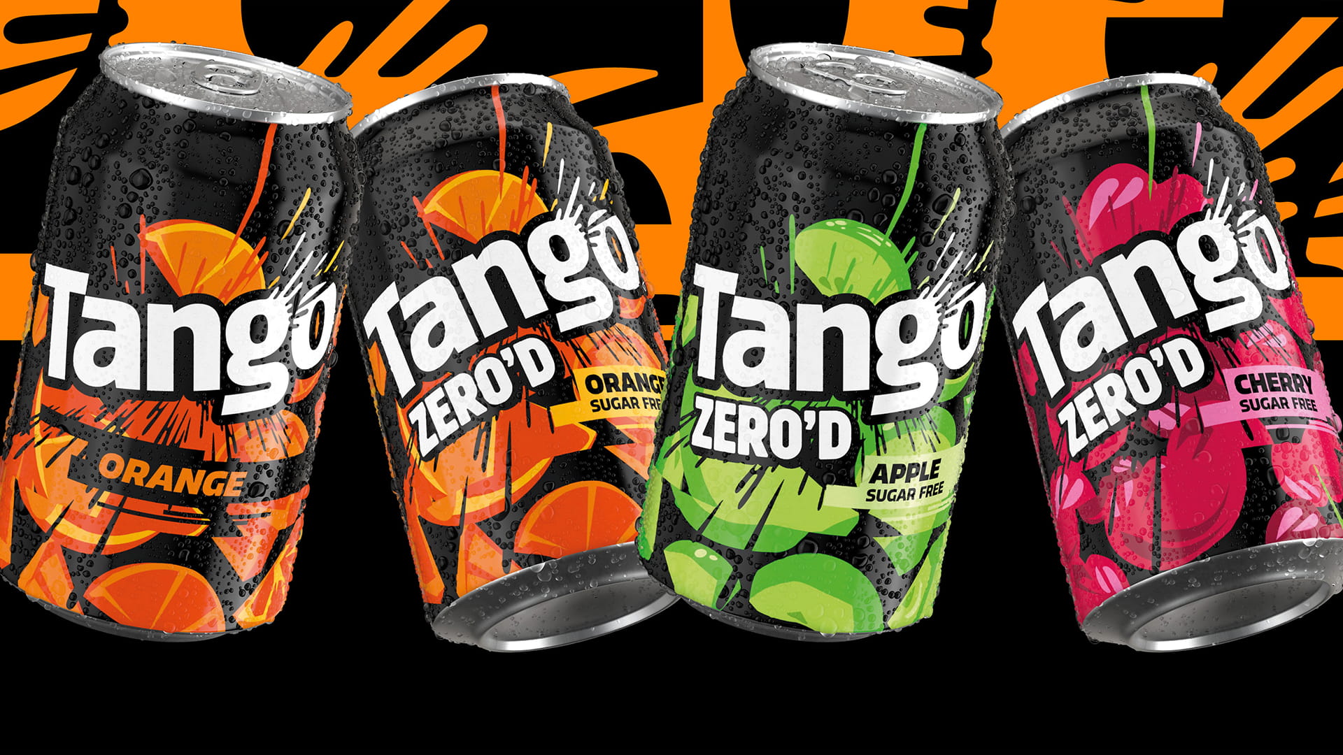
Tango has always followed its own path. Its gritty humour is tangy in spirit as well as in flavour. But culture keeps moving on. The brand needed a long-lasting new look that would keep it ahead of the pack without losing the boldness it’s always been famous for.
In a category dominated by more risk-averse global brands, Tango is all about uninhibited attitude. The new identity had to connect with Gen Y, Z and A drinkers by mirroring what they wear, watch and share. It had to jolt this chronically online generation back into the real world.
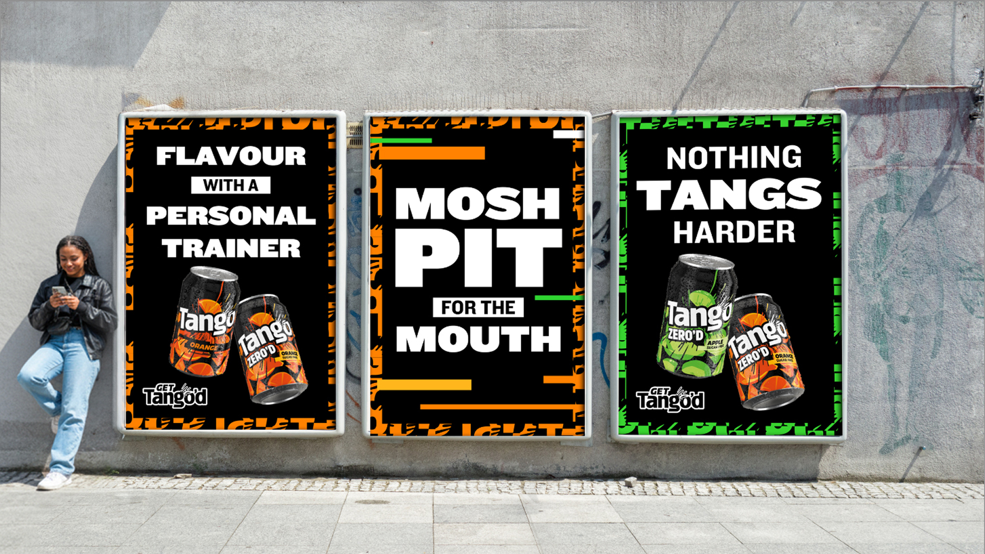
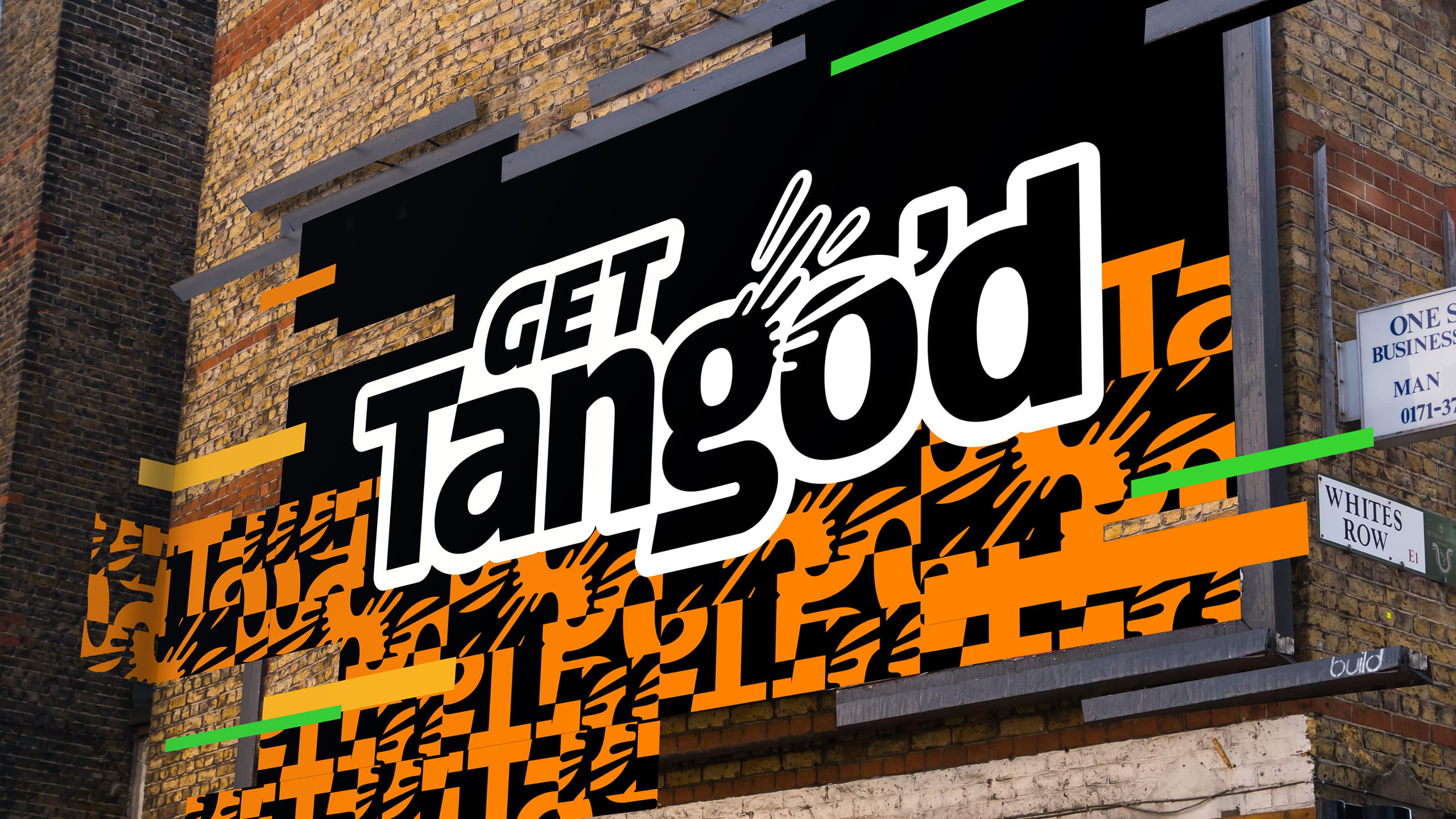
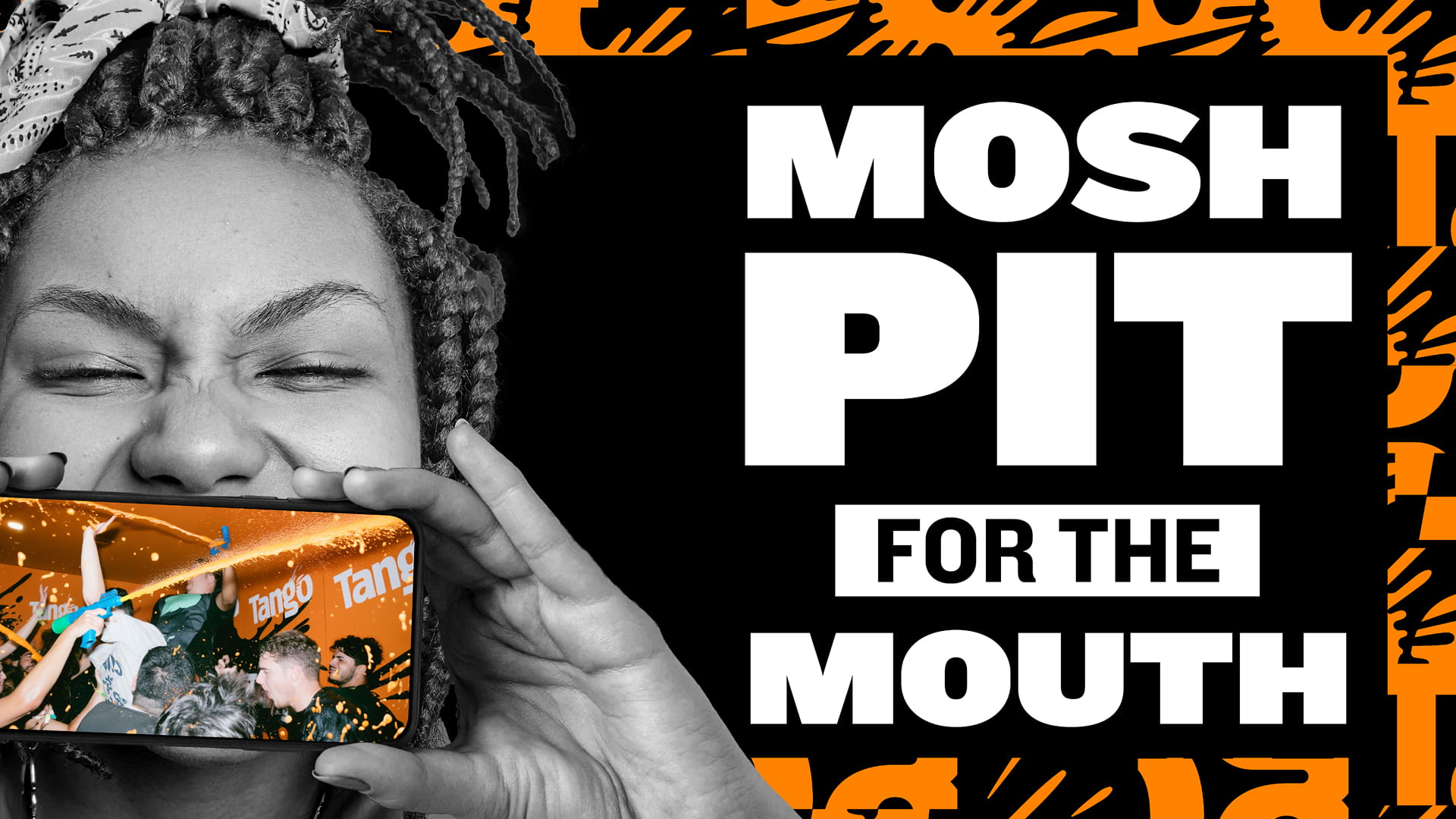
The design balances flex and potency, updating Tango boldness with a rich visual language that gives the brand a part to play in today’s urban life.
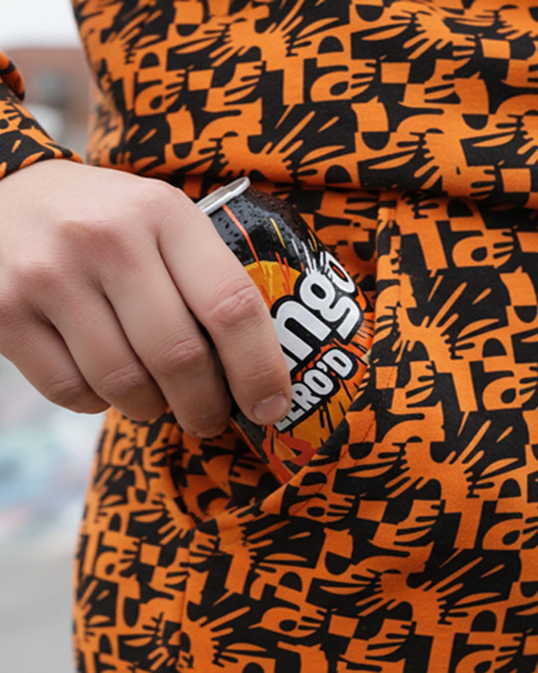
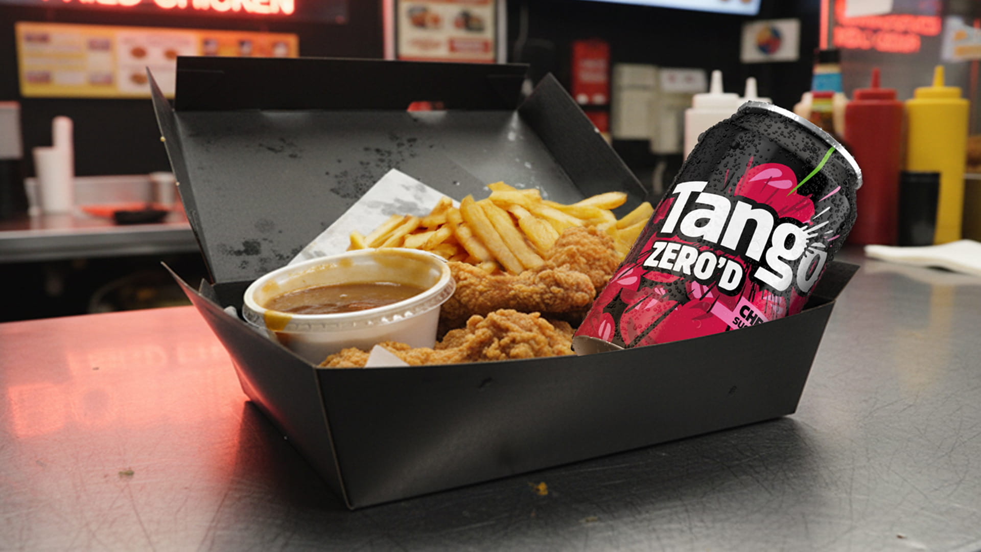
Energetic, spontaneous and up-close lifestyle photography invites you into the action. Dynamic typography collides with breaking frames and clashing colours. The bold tone delivers bursts of high energy refreshment; a springboard for a modernised system whose culturally on-point assets help Tango be part of the conversations that matter.


25 The Village,
101 Amies Street,
London SW11 2JW
+44 (0) 20 7924 4533
hello@bloom-london.com

